When did Hungarian hospitals reach the end of their capacity?

First, the usual stuff and then the 'surprises'
Let's see the usual charts first and then come a few 'surprises'.
With 199 new cases the official number of total coronavirus infections goes up to 806,790.

8 people died of coronavirus-related diseases yesterday, taking the death toll up to 29,904.

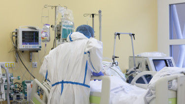
About hospital capacities
442 people are treated in hospital with COVID-19, and 51 of them are on ventilator.

Here are the same charts but only for the past three weeks.

And the following one, showing 7-day averages, is even more interesting.
The green line shows the ratio of active cases in hospitals, and the orange one shows the ratio of patients requiring mechanical ventilation.
In late August, early September, both lines were high and dropped sharply, because there were a lot of new infections, but not a high number of these people had to be hospitalised. And even those who were admitted were in good enough condition to avoid ventilation.
Then came the school opening in September and it had its impact by October. Lots of COVID-19 patients in hospital, a greater share of active cases in hospital. It was because testing was unable to keep up with the pandemic, and authorities detected only severe cases who ended up in hospital. The green line rose to over 7%, and the orange line also went up as more COVID-19 patients in hospitals had severe symptoms and required artificial ventilation.
And then all of a sudden both lines come to a halt. The number of people hospitalised with coronavirus infection is still on the rise, but a smaller share of the infected need professional care, and the share of patients needing mechanical ventilation also shrinks.

What else does this chart tell us? It shows that hospitals reached the end of their capacity in mid-November 2020, with 7,000 to 8,000 patients (officially) and 10,000 to 12,000 including wards filled with patients on suspicion of coronavirus infection. At that time, some 600 people were on ventilators.
The next wall in health care capacity was hit in late March 2021 at 12,000 to 13,000 (official) and 15,000 to 17,000 (actual) patients with 1,500 of them on ventilators. Note that neither of these capacity ceilings are constant, as the whole system can be reorganised, and it was in the spring, which saved many lives.
Then came a decision 'from above' that hospitals must return to business as usual, and they started to discharge every COVID-19 patient that were not in serious condition, to continue their recovery at home. The orange line immediately jumps to 12%, which means that only those with severe symptoms remained in hospitals. The orange line remains to this day in a range between 10% and 12%, and never before April was it that high. Meanwhile, the ratio of COVID-19 patients in hospitals to active cases dropped to 1%.
These changes took place so that the health care system can function normally, and also because a significant share of active patients are in this category only on paper, because GPs are just catching up with their paperwork reporting them as recovered. And, of course, the number of new cases is a lot lower now.
Observations about the positivity rate
Let's delve into Hungary's testing practices and more. Kudos to Balázs Pártos who provided such a great analysis of the charts and who is also the brain behind some of them.
Briefly about the test positivity rate: when a pandemic wave is on the rise, the shorter the daily averages are (columns), the higher they spike over the longer averages (lines). So, when the virus is spreading more rapidly, the top of these columns will be above the lines, and when a pandemic is in retreat, the columns end below the lines. When they are largely at the same level, there are the the turnarounds in the trend.
The pink line is the 3-day average positivity rate divided by the 21-day positivity rate (right-hand scale). If this rise over 100%, it signals the start of a new wave. When it's under 100%, the pandemic is receding. The jumps indicate dramatic and abrupt changes.

There are four such spikes or humps on this curve
- in early September
- end-October
- early December
- early January.
Here's some food for thought about these humps. The 1st, 2nd and 4th are clearly relating to schools: the start of the school year, the autumn break and transmissions at home, and the end of the winter break, back to school. The fluke in early December could also be linked to the autumn break. Kids go home, return to school, secondary schools shut down on 11 November due to a surge in COVID-19 cases, kids are back home. Again, this is just a hypothesis, but not a bad one at that.
The chart below shows practically the same as the one above, only on a shorter period, between 1 May and 10 June. The 3-day and 21-day positivity rate averages keep dropping, the orange line settles down between 50% and 60%. As said before, as long as it stays under 100% and the 3-day test positivity average remains lower than the 21-day average of the positivity rate, we're okay. When the orange line starts to rise, there's a change in the trend, but only in this ratio, i.e. the rate of the decline diminishes, the improvement decelerates but it's still an improvement.

About the vaccination campaign
And now two (alright, one and half) charts on how Hungary is doing in its vaccination campaign.
The first one shows the percentage of Hungary's population that received their first and second doses, as well as a 14-day average of these figures. Why 14 days? Because you'll have some degree of protection within 14 to 21 days after the first jab, and full protection 7-10 days after the second one. Hence, the lines give you a better idea of the actual 'immunity' of those that have been inoculated. More accurate figures can be achieved by taking into consideration the efficacy of the different vaccines administered, though.

The chart on the left depicts the same as the one above but only for the past month (10 May - 10 June). The areas show the 14-day averages and the lines the normal percentage of the population vaccinated with the 1st and 2nd doses.
The right-hand chart is a snapshot of the vaccination coverage as of 10 June, i.e. the share of the population that can be considered [partly or fully] protected after their respective first and second jabs.

Cover photo: Getty Images